LivAway Suites
Leveraged Scandinavian design methodology to craft a clean, minimal identity for an extended-stay hotel brand, emphasizing simplicity, functionality, and timeless elegance.
Services—
Brand Identity
Credits—
Designers: Karen Jung, Mia Conklin

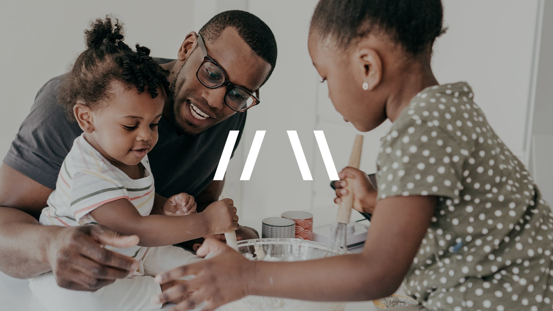
LivAway Suites welcomes guests looking for a comfortable, affordable stay.
The idea of “home” is important as guests are those who’ve been displaced from their homes or are professionals traveling on extended assignments within the military, healthcare and education fields.
The logomark references a home’s roof and uses angels found within the logotype visualizing that LivAway is your temporary home.
